Plot 1D histograms
The examples below make use of a numpy ndarray df containing dummy data (you may also use a pandas dataframe), that can be loaded with:
from plothist_utils import get_dummy_data

df = get_dummy_data()
Note
This page presents functions of plothist step by step and gives information about how to use them.
To reproduce the examples, please visit the example gallery, because it contains a standalone script for each example, that you can run directly.
Note
All the functions used in the examples below can take a lot more arguments to customize the plot, see the Package references for more details.
Simple 1D histogram
To plot a simple 1D histogram, you first need to create a histogram object with the make_hist() function that you can then plot with the plot_hist() function:
import matplotlib.pyplot as plt

from plothist import make_hist, plot_hist

name = "variable_0"

fig, ax = plt.subplots()

h = make_hist(df[name])

plot_hist(h, ax=ax)

ax.set_xlabel(name)
ax.set_ylabel("Entries")

fig.savefig("1d_hist_simple.svg", bbox_inches="tight")

Note
The function make_hist() returns a boost_histogram.Histogram object that supports potentially weighted data. You may call the make_hist() function without input data and fill the histogram object later in your code. An advantage of separating the histogramming from the plotting is that you can plot large datasets without having to load all the data into memory (see this tutorial).
To add multiple histograms to the same plot, you can just call the make_hist() and plot_hist() functions multiple times:
import matplotlib.pyplot as plt

from plothist import make_hist, plot_hist

name = "variable_1"
category = "category"

x1 = df[name][df[category] == 1]
x2 = df[name][df[category] == 2]

x_range = (min(*x1, *x2), max(*x1, *x2))

h1 = make_hist(x1, bins=50, range=x_range)
h2 = make_hist(x2, bins=50, range=x_range)

fig, ax = plt.subplots()

plot_hist(h1, ax=ax, histtype="step", linewidth=1.2, label="c1")
plot_hist(h2, ax=ax, histtype="step", linewidth=1.2, label="c2")

ax.set_xlabel(name)
ax.set_ylabel("Entries")
ax.set_xlim(x_range)
ax.legend()

fig.savefig("1d_elt1.svg", bbox_inches="tight")

To stack them, use the argument stacked=True in the plot_hist() function:
fig, ax = plt.subplots()

plot_hist(
    [h1, h2],
    label=["c1", "c2"],
    ax=ax,
    edgecolor="black",
    linewidth=0.5,
    histtype="stepfilled",
    stacked=True,
)

ax.set_xlabel(name)
ax.set_ylabel("Entries")
ax.set_xlim(x_range)
ax.legend()

fig.savefig("1d_elt1_stacked.svg", bbox_inches="tight")

Histogram with error bars
To plot a simple histogram with error bars, use the plot_error_hist() function. The default error bars are the Poisson standard deviation derived from the variance stored in the histogram object.
import matplotlib.pyplot as plt

from plothist import make_hist, plot_error_hist

name = "variable_1"
category = "category"

x1 = df[name][df[category] == 3]

h1 = make_hist(x1)

fig, ax = plt.subplots()

plot_error_hist(h1, ax=ax, color="black", label="$h1_{err}$")

ax.set_xlabel(name)
ax.set_ylabel("Entries")
ax.set_ylim(ymin=0)
ax.legend()

fig.savefig("1d_elt2.svg", bbox_inches="tight")

You can also display the error as an asymmetrical uncertainties based on a Poisson confidence interval with the argument uncertainty_type="asymmetrical".
Note
Asymmetrical uncertainties can only be computed for unweighted histograms, because the bin contents of a weighted histogram do not follow a Poisson distribution. More information in Notes on statistics.
Comparing two histograms
To compare two histograms, you can use the plot_two_hist_comparison() function. The function takes two histograms as input and compares them using one of the seven comparison methods available: ratio, split_ratio, pull, difference, relative_difference, asymmetry and efficiency. The examples below are using the histograms defined above.
Ratio
Ratio is the default comparison method:
from plothist import plot_two_hist_comparison

# Default comparison is ratio
fig, ax_main, ax_comparison = plot_two_hist_comparison(
    h1,
    h2,
    xlabel=name,
    ylabel="Entries",
    h1_label="h1",
    h2_label="h2",
)

fig.savefig("1d_comparison_ratio.svg", bbox_inches="tight")

Split ratio
When the split_ratio option is used, both the h1 and h2 uncertainties are scaled down by the h2 bin contents. The h2 adjusted uncertainties are shown separately as a hatched area. In practice, the split_ratio comparison option is used when h1 is filled with measured data and h2 is a model, see Compare data and model section for more details.
from plothist import plot_two_hist_comparison

fig, ax_main, ax_comparison = plot_two_hist_comparison(
    h1,
    h2,
    xlabel=name,
    ylabel="Entries",
    h1_label=r"$\mathbf{h1}$",
    h2_label=r"$\mathbf{h2}$",
    comparison="split_ratio",
)

fig.savefig("1d_comparison_split_ratio.svg", bbox_inches="tight")

Pull
To perform a pull comparison between two histograms:
from plothist import plot_two_hist_comparison

fig, ax_main, ax_comparison = plot_two_hist_comparison(
    h1,
    h2,
    xlabel=name,
    ylabel="Entries",
    h1_label=r"$h_1$",
    h2_label=r"$h_2$",
    comparison="pull",  # <---
)

fig.savefig("1d_comparison_pull.svg", bbox_inches="tight")

Difference
To plot the difference between two histograms:
from plothist import add_text, plot_two_hist_comparison

fig, ax_main, ax_comparison = plot_two_hist_comparison(
    h1,
    h2,
    xlabel=name,
    ylabel="Entries",
    h1_label=r"$\mathcal{H}_{1}$",
    h2_label=r"$\mathcal{H}_{2}$",
    comparison="difference",  # <--
)

add_text("Comparison of two hist with difference plot", ax=ax_main)
add_text("Difference ax", x="right", ax=ax_comparison)

fig.savefig("1d_comparison_difference.svg", bbox_inches="tight")

Relative difference
To plot the relative difference between two histograms:
from plothist import plot_two_hist_comparison

fig, ax_main, ax_comparison = plot_two_hist_comparison(
    h1,
    h2,
    xlabel=name,
    ylabel="Entries",
    h1_label=r"$\mathbf{H\,\,1}$",
    h2_label=r"$\mathbf{H\,\,2}$",
    comparison="relative_difference",  # <--
)

fig.savefig("1d_comparison_relative_difference.svg", bbox_inches="tight")

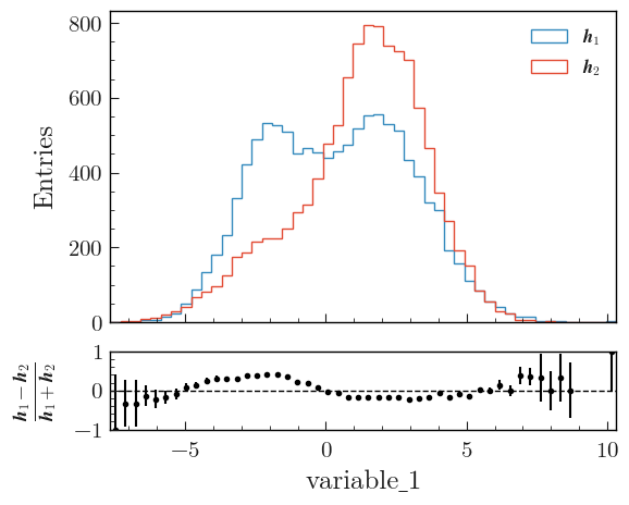
Asymmetry
To plot the asymmetry between two histograms:
from plothist import plot_two_hist_comparison

fig, ax_main, ax_comparison = plot_two_hist_comparison(
    h1,
    h2,
    xlabel=name,
    ylabel="Entries",
    h1_label=r"$\mathbfit{h}_1$",
    h2_label=r"$\mathbfit{h}_2$",
    comparison="asymmetry",  # <--
)

fig.savefig("1d_comparison_asymmetry.svg", bbox_inches="tight")
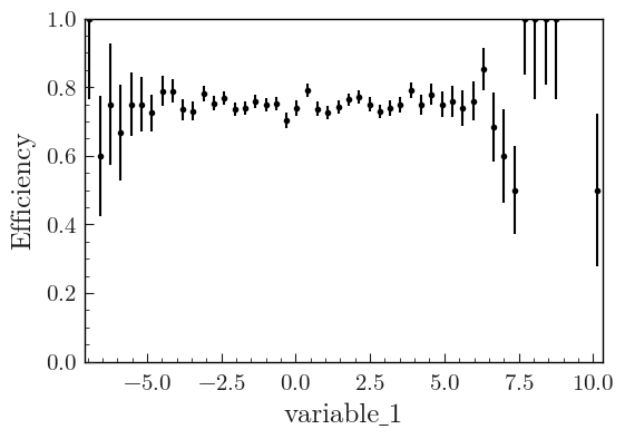
Efficiency
This example shows how to plot the ratio between two histograms h1 and h2 when the entries of h1 are a subset of the entries of h2. The variances are calculated according to the formula given in Notes on statistics.
from plothist import plot_two_hist_comparison

fig, ax_main, ax_comparison = plot_two_hist_comparison(
    h_sample,
    h_total,
    xlabel=name,
    ylabel="Entries",
    h1_label=r"$\mathit{H}_{Sample}$",
    h2_label=r"$\mathit{H}_{Total}$",
    comparison="efficiency",  # <--
)

fig.savefig("1d_comparison_efficiency.svg", bbox_inches="tight")

To only plot the comparison
With any of the comparison shown above, you can use the plot_comparison() function to only plot the comparison. Here is an example with the efficiency comparison of two histograms:
import matplotlib.pyplot as plt

from plothist import plot_comparison

fig, ax = plt.subplots()

plot_comparison(h_sample, h_total, ax=ax, xlabel=name, comparison="efficiency")

fig.savefig("1d_comparison_only_efficiency.svg", bbox_inches="tight")
Get the values of the comparison
To easily get the values and the uncertainties of the comparison, the get_comparison() function returns three arrays: the values, the lower uncertainties and the upper uncertainties. Here is an example with the ratio comparison:
from plothist import get_comparison

values, lower_uncertainties, upper_uncertainties = get_comparison(h1, h2, comparison="ratio")
Mean histogram (profile plot)
The function make_hist() returns a counting histogram (technically, a boost_histogram.Histogram of COUNT kind), where each bin holds the total number of data points or their weighted sum.
The boost_histogram package also supports mean histograms, where each bin holds the (possibly weighted) average of a sample.
The example below shows how to create a mean histogram (also called a profile) in boost_histogram and plot it with plothist.
In this example, the data points and the error bars are the average value and the standard deviation of the sample in each bin, respectively.
Note that most functions in plothist work only with counting histograms and will raise an error if you try to use them with a mean histogram.
import boost_histogram as bh
import matplotlib.pyplot as plt

from plothist import plot_error_hist

# Regular axis with 3 bins from -1 to 1
axis = bh.axis.Regular(3, -1, 1)

# 6 data points, two in each bin
data = [-0.5, -0.5, 0.0, 0.0, 0.5, 0.5]
sample = [0, 100, 40, 60, 0, 20]
weights = [1, 1, 1, 1, 1, 1]

h = bh.Histogram(axis, storage=bh.storage.WeightedMean())
h.fill(data, weight=weights, sample=sample)

fig, ax = plt.subplots()

plot_error_hist(h, ax=ax)

ax.set_xlabel("Variable")
ax.set_ylabel("Mean")
ax.set_xlim(-1, 1)

fig.savefig("1d_profile.svg", bbox_inches="tight")

Histogram with category axis
The function make_hist() returns a a boost_histogram.Histogram with a regular or a variable axis, but the boost_histogram package also supports categorical axes.
The examples below show how to create a histogram with a category axis in boost_histogram and plot it with plothist.
Integer category
import boost_histogram as bh
import matplotlib.pyplot as plt

from plothist import plot_hist

# 3 integer categories
int_categories = [-10, 5, 72]

# Integer category axis with 3 bins
axis = bh.axis.IntCategory(categories=int_categories)

# 6 data points,
data = [-10, -10, 5, 72, 72, 72]

# Create and fill the histogram
h = bh.Histogram(axis, storage=bh.storage.Weight())
h.fill(data)

# Plot the histogram
fig, ax = plt.subplots()

plot_hist(h, ax=ax)

# Set the x-ticks to the middle of the bins and label them
ax.set_xticks([i + 0.5 for i in range(len(int_categories))])
ax.set_xticklabels(int_categories)
ax.minorticks_off()

ax.set_xlabel("Integer Category")
ax.set_ylabel("Entries")
ax.set_xlim(0, len(int_categories))

fig.savefig("1d_int_category.svg", bbox_inches="tight")

Note
When we create the histograms in this example, we use the argument storage=bh.storage.Weight().
This is because the functions in plothist assume histograms with a storage that supports weighted data, where the variance of each bin is tracked (more details here and there).
When creating histograms with regular or variable axes with the function make_hist(), as in most of the previous examples, the storage is automatically set to bh.storage.Weight(), so the user does not have to worry about it.
String category
import boost_histogram as bh
import matplotlib.pyplot as plt

from plothist import plot_hist

# 3 str categories
str_categories = ["a", "b", "c"]

# String category axis with 3 bins
axis = bh.axis.StrCategory(categories=str_categories)

# 6 data points,
data = ["a", "a", "a", "b", "b", "c"]

# Create and fill the histogram
h = bh.Histogram(axis, storage=bh.storage.Weight())
h.fill(data)

# Plot the histogram
fig, ax = plt.subplots()

plot_hist(h, ax=ax)

# Set the x-ticks to the middle of the bins and label them
ax.set_xticks([i + 0.5 for i in range(len(str_categories))])
ax.set_xticklabels(str_categories)
ax.minorticks_off()

ax.set_xlabel("String Category")
ax.set_ylabel("Entries")
ax.set_xlim(0, len(str_categories))

fig.savefig("1d_str_category.svg", bbox_inches="tight")

Using multiple histograms
With multiple histograms, the plot_hist() function will correctly put them side by side, because it is a wrapper around the hist() function from matplotlib that provides this functionality.
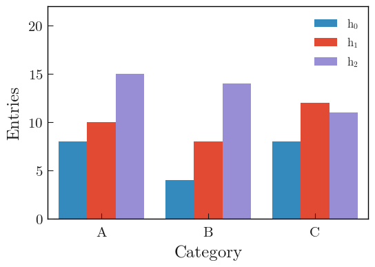
import boost_histogram as bh
import matplotlib.pyplot as plt
import numpy as np

from plothist import plot_hist

rng = np.random.default_rng(8311311)

# String categories
categories = ["A", "B", "C"]

# Axis with the 3 bins
axis = bh.axis.StrCategory(categories=categories)

## Works also with integers
# categories = [-5, 10, 137]
# axis = bh.axis.IntCategory(categories=categories)

# Generate data for 3 histograms
data = [
    rng.choice(categories, 20),
    rng.choice(categories, 30),
    rng.choice(categories, 40),
]

# Create and fill the histograms
histos = [bh.Histogram(axis, storage=bh.storage.Weight()) for _ in range(len(data))]
histos = [histo.fill(data[i]) for i, histo in enumerate(histos)]

labels = [f"$h_{{{i}}}$" for i in range(len(histos))]

# Plot the histogram
fig, ax = plt.subplots()

# Use a specificity of matplotlib: when a list of histograms is given, it will plot them side by side unless stacked=True or histtype is a "step" type.
plot_hist(histos, ax=ax, label=labels)

# Set the x-ticks to the middle of the bins and label them
ax.set_xlim(0, len(categories))
ax.set_xticks([i + 0.5 for i in range(len(categories))])
ax.set_xticklabels(categories)
ax.minorticks_off()
# Get nice looking y-axis ticks
ax.set_ylim(top=int(np.max([np.max(histo.values()) for histo in histos]) * 1.5))

ax.set_xlabel("Category")
ax.set_ylabel("Entries")
ax.legend()

fig.savefig("1d_side_by_side.svg", bbox_inches="tight")