Other advanced examples
This section shows how to use the plothist package to make more complex plots. The examples below take advantage of the flexibility of the package to produce more advanced plots with ease. For each example, the code is commented to explain the logic and steps taken to produce the plots.
The examples use of a numpy ndarray df containing dummy data (you may also use a pandas dataframe), that can be loaded with:
from plothist_utils import get_dummy_data

df = get_dummy_data()
Advanced example comparing two histograms
In this example, we will compare two tuples of histograms and use pull and ratio comparisons. First, we make the histograms and scale them. Then, we plot the histograms and the comparison plots on different axes:

from plothist import (
    create_comparison_figure,
    get_color_palette,
    make_hist,
    plot_comparison,
    plot_error_hist,
    plot_hist,
)

name = "variable_1"
category = "category"

x1 = df[name][df[category] == 1]
x2 = df[name][df[category] == 4]
x3 = df[name][df[category] == 3]
x4 = df[name][df[category] == 5]

x_range = (-9, 9)

h1 = make_hist(x3, bins=50, range=x_range)
h2 = make_hist(x4, bins=50, range=x_range)
h3 = make_hist(x1, bins=50, range=x_range)
h4 = make_hist(x2, bins=50, range=x_range)

# Create the 3 axes that we need for this plot
fig, axes = create_comparison_figure(
    figsize=(6, 6), nrows=3, gridspec_kw={"height_ratios": [5, 1, 1]}
)

# Assign each axes: 1 to plot the histograms and 2 for the comparison plots
ax_main, ax1_comparison, ax2_comparison = axes

# Get the red and the blue from the default color cycle
colors = get_color_palette("ggplot", 2)

# Here, we use step as a histtype to only draw the line
plot_hist(h1, label="Train A", ax=ax_main, histtype="step", linewidth=1.2, density=True)
plot_hist(h3, label="Train B", ax=ax_main, histtype="step", linewidth=1.2, density=True)
# And then, to make the plot easier to read, we redraw them with stepfilled, which add color below the line
plot_hist(
    h1, ax=ax_main, histtype="stepfilled", color=colors[0], alpha=0.2, density=True
)
plot_hist(
    h3, ax=ax_main, histtype="stepfilled", color=colors[1], alpha=0.2, density=True
)

# We plot 2 additional histograms with point style
plot_error_hist(h2, label="Test A", ax=ax_main, color="blue", density=True)
plot_error_hist(h4, label="Test B", ax=ax_main, color="red", density=True)

# First comparison is using pulls. We also change the color of the bars to make the plot easier to read
plot_comparison(
    h2, h1, ax=ax1_comparison, comparison="pull", color=colors[0], alpha=0.7
)
# Second comparison is using the default "ratio". Same strategy as pulls
plot_comparison(h4, h3, ax=ax2_comparison, color=colors[1], alpha=0.7)

# Harmonize the range of each axes
ax_main.set_xlim(x_range)
ax1_comparison.set_xlim(x_range)
ax2_comparison.set_xlim(x_range)

# Set the labels for the different axes
ax_main.set_ylabel("Entry density")
ax1_comparison.set_ylabel("$Pull_{A}$")
ax2_comparison.set_ylabel("$Ratio_{B}$")
ax2_comparison.set_xlabel("Variable [unit]")

# Add the legend
ax_main.legend(loc="upper left")

# Align the ylabels
fig.align_ylabels()

fig.savefig("1d_comparison_advanced.svg", bbox_inches="tight")
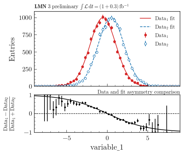
Advanced example using asymmetry comparison
This example shows how to plot an asymmetry plot between two histograms and two functions. Information on how to convert a function from an external fitting package to an object that can be used by plothist can be found in Plot result of a fit.
import numpy as np
from scipy.stats import norm

from plothist import (
    add_luminosity,
    add_text,
    create_comparison_figure,
    make_hist,
    plot_comparison,
    plot_error_hist,
    plot_function,
)


# Define some random functions that will be used as Data fit functions
def f1(x: np.ndarray) -> np.ndarray:
    return 4000 * norm.pdf(x, loc=-0.5, scale=1.6)


def f2(x: np.ndarray) -> np.ndarray:
    return 4000 * norm.pdf(x, loc=0.5, scale=1.6)


name = "variable_1"
category = "category"

x1 = df[name][df[category] == 5]

x_range = (-9, 9)

# Create the histograms used as data
h1 = make_hist(x1 - 2.5, bins=50, range=x_range)
h2 = make_hist(x1 - 1.5, bins=50, range=x_range)

# Create the figure
fig, (ax_main, ax_comparison) = create_comparison_figure(
    gridspec_kw={"height_ratios": [2, 1]}
)

# Define the marker style
marker_1 = {
    "color": "tab:red",
    "markeredgecolor": "tab:red",
    "ls": "None",
    "fmt": "o",
    "markersize": 5,
    "label": "$Data_1$",
}

marker_2 = {
    "color": "tab:blue",
    "markerfacecolor": "white",
    "markeredgecolor": "tab:blue",
    "ls": "None",
    "fmt": "o",
    "markersize": 5,
    "label": "$Data_2$",
}

# Plot the data
plot_error_hist(
    h1,
    ax_main,
    uncertainty_type="symmetrical",
    density=False,
    **marker_1,
)

plot_error_hist(
    h2,
    ax_main,
    uncertainty_type="symmetrical",
    density=False,
    **marker_2,
)

# Plot the functions
plot_function(f1, x_range, ax_main, color=marker_1["color"], label="Data$_1$ fit")
plot_function(
    f2, x_range, ax_main, color=marker_2["color"], linestyle="--", label="Data$_2$ fit"
)

# Plot the asymmetry comparison between the 2 histograms
plot_comparison(
    h1,
    h2,
    ax=ax_comparison,
    h1_label=r"$Data_1$",
    h2_label=r"$Data_2$",
    comparison="asymmetry",
    comparison_ylim=(-1, 1),
)


# Define the asymmetry of the 2 functions
def asymmetry(x):
    return (f1(x) - f2(x)) / (f1(x) + f2(x))


# Plot the asymmetry of the 2 functions
plot_function(asymmetry, x_range, ax_comparison, color="black")

ax_main.legend()

fig.align_ylabels()

ax_main.set_xlim(x_range)
ax_main.set_ylim(ymin=0)
ax_main.set_ylabel("Entries")
ax_main.legend()

ax_comparison.set_xlim(x_range)
ax_comparison.set_xlabel(name)

add_text("Data and fit asymmetry comparison", ax=ax_comparison, x="right")

add_luminosity(
    collaboration="LMN 3", ax=ax_main, lumi="(1 + 0.3)", preliminary=True, x="left"
)

fig.savefig("asymmetry_comparison_advanced.svg", bbox_inches="tight")
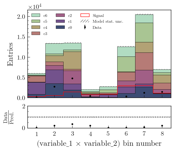
Flatten 2D variable
Compare data and stacked histogram for a flatten 2D variable:
from plothist import (
    flatten_2d_hist,
    get_color_palette,
    make_2d_hist,
    plot_data_model_comparison,
    plot_hist,
)

# Define the histograms

key1 = "variable_1"
key2 = "variable_2"
# Bins [-12,0], [0,12] for variable 1,
# and bins [-12,-5], [-5,0], [0,5], [5,12] for variable 2
bins = [[-12, 0, 12], [-12, -5, 0, 5, 12]]
category = "category"

# Define datasets

signal_mask = df[category] == 7
data_mask = df[category] == 8

background_categories = [0, 1, 2, 3, 4, 5, 6]
background_categories_labels = [f"c{i}" for i in background_categories]
background_categories_colors = get_color_palette(
    "cubehelix", len(background_categories)
)

background_masks = [df[category] == p for p in background_categories]

# Make histograms

data_hist = make_2d_hist(
    [df[key][data_mask] for key in [key1, key2]], bins=bins, weights=1
)
background_hists = [
    make_2d_hist([df[key][mask] for key in [key1, key2]], bins=bins, weights=1)
    for mask in background_masks
]
signal_hist = make_2d_hist(
    [df[key][signal_mask] for key in [key1, key2]], bins=bins, weights=1
)

# Flatten the 2D histograms
data_hist = flatten_2d_hist(data_hist)
background_hists = [flatten_2d_hist(h) for h in background_hists]
signal_hist = flatten_2d_hist(signal_hist)

# Compare data and stacked histogram
fig, ax_main, ax_comparison = plot_data_model_comparison(
    data_hist=data_hist,
    stacked_components=background_hists,
    stacked_labels=background_categories_labels,
    stacked_colors=background_categories_colors,
    xlabel=rf"({key1} $\times$ {key2}) bin number",
    ylabel="Entries",
)

plot_hist(
    signal_hist,
    ax=ax_main,
    color="red",
    label="Signal",
    histtype="step",
)

for ax in [ax_main, ax_comparison]:
    ax.set_xticks([i + 0.5 for i in range(8)])
    ax.tick_params(axis="x", which="minor", bottom=False)
ax_comparison.set_xticklabels([str(i + 1) for i in range(8)])

ax_main.legend(ncol=3, fontsize=10, loc="upper left")

fig.savefig("model_examples_flatten2D.svg", bbox_inches="tight")
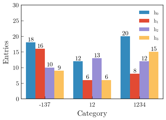
Multiple histograms, side by side, with numbers on top
This example shows how to plot multiple 1D histograms side by side, with numbers on top of each bars. The code is similar to the one used in the Using multiple histograms section.
import boost_histogram as bh
import matplotlib.pyplot as plt
import numpy as np

from plothist import plot_hist

rng = np.random.default_rng(83113111)

# Integer categories
categories = [-137, 12, 1234]
axis = bh.axis.IntCategory(categories=categories)

# Generate data for 3 histograms
data = [
    rng.choice(categories, 50),
    rng.choice(categories, 30),
    rng.choice(categories, 35),
    rng.choice(categories, 30),
]

# Create and fill the histograms
histos = [bh.Histogram(axis, storage=bh.storage.Weight()) for _ in range(len(data))]
histos = [histo.fill(data[i]) for i, histo in enumerate(histos)]

labels = [f"$h_{{{i}}}$" for i in range(len(histos))]
colors = ["#348ABD", "#E24A33", "#988ED5", "#FBC15E"]

# Plot the histogram
fig, ax = plt.subplots()

# Use a specificity of matplotlib: when a list of histograms is given, it will plot them side by side unless stacked=True or histtype is a "step" type.
plot_hist(histos, ax=ax, label=labels, color=colors)


# Add the number of entries on top of each bar
# Get the correct shift in x-axis for each bar
def calculate_shifts(width: float, n_bars: int) -> np.ndarray:
    half_width = width / 2
    shift = np.linspace(-half_width, half_width, n_bars, endpoint=False)
    shift += width / (2 * n_bars)
    return shift


bin_width = 0.8
shift = calculate_shifts(bin_width, len(histos))

# Loop over the histograms, add on top of each bar the number of entries
for i, histo in enumerate(histos):
    for j, value in enumerate(histo.values()):
        ax.text(
            j + 0.5 + shift[i],
            value,
            int(
                value
            ),  # If weighted, f"{height:.1f}" can be used as a better representation of the bin content
            color="black",
            ha="center",
            va="bottom",
        )

# Set the x-ticks to the middle of the bins and label them
ax.set_xlim(0, len(categories))
ax.set_xticks([i + 0.5 for i in range(len(categories))])
ax.set_xticklabels(categories)
ax.minorticks_off()
# Get nice looking y-axis ticks
ax.set_ylim(top=int(np.max([np.max(histo.values()) for histo in histos]) * 1.5))

ax.set_xlabel("Category")
ax.set_ylabel("Entries")
ax.legend()

fig.savefig("1d_side_by_side_with_numbers.svg", bbox_inches="tight")